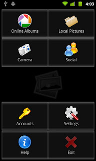
Although the old menu was looking reasonably well on a phone, it was not the best choice for a tablet. The new layout adapts itself depending on the device's resolution, as well as and the current orientation.
Many thanks to Dan and Matth for suggesting this change!


No comments:
Post a Comment